In the bustling concrete wilderness of New York City, inspiration lurks in the most unpredictable of cityscapes—even amidst the clatter and hum of a daily subway commute. It’s an environment where haste and routine collide, where anonymous throngs push through their itineraries with eyes fixed on screens or floors. In this mundane metropolitan tapestry, Topps senior designer Phil Imbriano discovered an unforeseen muse while on his usual rumble down the underbelly of the Big Apple.
The cornerstone of this eureka moment? A red-and-silver badge in the corner of the subway train car. As pedestrians barely took notice, lost in their own world of morning grogginess or evening fatigue, Imbriano’s eyes landed on those sleek lines and sweeping curves that danced in harmony. In just a click, he’d captured the essence that would roll the bases of creative innovation—a snapshot seeding future genius. By the time he made it to his desk at Topps, his sketchpad was pregnant with ideas sprouted during the subway ride home.
Thus began the life cycle of what would ultimately bloom into Topps Series 1 baseball cards of 2025, marking their official debut with a flair today. Each card now carries the whispers of hundreds of conversations taking place in a New York subway, the ethereal hum of steel against steel echoing in its design.
“I love drawing inspiration from everyday things,” Imbriano said with a gleam in his artistic eye. “It could be a building, a sign—just something that catches my eye. I take pictures and refer back to them later. You never know when something simple will turn into something big.” Simple, ordinary—a value unexpectedly exalted to the grandeur of collectible artistry.
The new design offers two daring lines sweeping up the left side and top of the card. It’s an attitude that might capture the attention of card aficionados who reminisce about the 1982 Topps set—a subtle but delightful delineation where lines are masterfully tailored to represent each team’s distinct colors. Within these strokes of color lies a nod—a touch of nostalgia—that wasn’t even consciously intended. Imbriano explained that his initial spark had latched onto the woodgrain aesthetics of both the ’62 and ’87 sets. “The ’82 connection was a happy accident,” Imbriano recounted, chuckling. “But I think it works because it blends vintage style with a modern twist.”
Just as Imbriano’s design process gained momentum, an internal coliseum of ideas arose amongst Topps’ own gladiators of creativity. A whirlpool of 20 contending concepts vied for supremacy, each facing the ruthless gauntlet of the months-long selection procedure. Through persistence and a touch of serendipity, Imbriano’s design ascended the ranks. A neat touch from forgotten, unsung designs also resurrected here on this year’s cards—a small field graphic tucked neatly in the bottom right corner, discreetly stating the player’s position.
From the eclectic subway inspiration to tangible reality, Imbriano’s journey was not a path without structure. It skirted through various drafts, as no fewer than ten iterations took form before arriving at the final masterpiece.
“There’s so much that goes into this process,” he shared. The labyrinthine craft that leads to these final cards is, unbeknownst to many, a cacophony of relentless revision and vibrant imagination.
Once digital designs get the green light, tangible prototypes take to the field. Here, potential turns to palpable reality, as Topps takes an old-school approach—as old as the cards themselves—to evaluate the products by touch and feel. Clay Luraschi, the senior vice president of product at Topps, illuminated the stakes of this tactile tradition.
“When we’re down to the final five designs, we actually print them out and simulate opening a pack,” Luraschi said, echoing excitement of childhood nostalgia. “It’s a long, competitive process, and it’s one of the biggest debates we have in the office all year.”
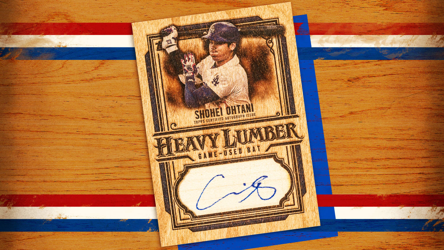
Beyond the crisp base set, 2025 offers a cornucopia of subsets such as Future Stars, All-Topps Team, and fan-friendly showcases like Training Grounds and Call to the Hall. It includes the City Connect Swatch Collection and Heavy Lumber Autographs. All are cherry-topped with the Signature Tunes, still a vibrant conversation between players and music maestros.
The longevity of the cards stretches beyond this singular year, as Imbriano himself sees these as mini movie posters—each card a piece of visual storytelling, a testament in the timeline of baseball history. “I approach designing cards like I would a movie poster,” Imbriano passionately exclaimed, “Each card should stand out on its own, almost like a mini poster in a collector’s hands.”
Luraschi, a distinguished voice in Topps lore, succinctly encapsulated this aim. “I think Phil’s design is incredible,” he remarked. “Fifty years from now, people should be able to look at a card and instantly recognize the year it’s from. This one absolutely nails that idea.” Indeed, the quiet rattle of a subway card will echo through ages, captured and crystallized in rectangles of card stock—the 2025 Topps Series 1.